
Violet Elmer's Bird patterns - Part One
Fantasia
Designed by Violet Elmer
by Harvey Pettitwith border artwork by Barbara Anne Lee
This is the first in a series of articles on the bird patterns introduced by Violet Elmer during her tenure as designer of Best Ware patterns at the Carlton Works from 1930 to 1938, and again after the war from 1946 to 1949, when she worked part‑time, as did Rene Pemberton, who had succeeded her in 1938 when Violet left to marry.
An introduction to Miss Elmer
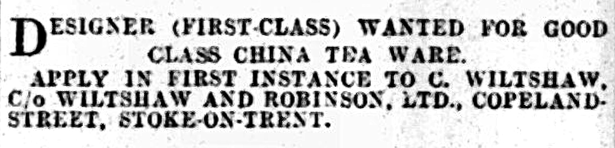
In one of our interviews with Violet in the 1980s, the seventy-five-year-old recalled how she came to work for Carlton Ware. It was not, as one might expect, in response to the advertisement below that Cuthbert Wiltshaw had placed in the local newspaper in March 1928.
In the winter of 1927-28, while her older sister sat by the
coal fire reading a women’s magazine, Miss Elmer thought to look through the publication for
pottery advertisements. It occurred to her to send some of her prize‑winning drawings from a
recent Royal Society of Arts competition to the first pottery manufacturer she came across,
to see whether there might be any prospects.
That Pottery was Wiltshaw & Robinson, makers of Carlton Ware.
Violet enclosed a long letter describing "all the clever things I have done"
in the way that only the young dare. The letter was forgotten — until,
to her surprise, Cuthbert Wiltshaw wrote back, asking how much she wanted for her
designs for a lustre bowl and two tea‑ware patterns.
Serendipity
Cuthbert had just bought the Vine Pottery, a china works previously owned by Birks Rawlins, so Miss Elmer’s letter and drawings arrived at an apposite moment. Violet had no idea what to ask for her work, but her dilemma was resolved a few days later when another letter arrived from Cuthbert, asking whether she would consider a permanent position as a designer for his newly acquired china works. And so, after much opposition from her parents, Miss Elmer found herself, at the age of twenty-one, leaving her home town of Oxford for the smoke of the Potteries and its forest of bottle ovens, from which beautiful things emerged — many of them to be by her.
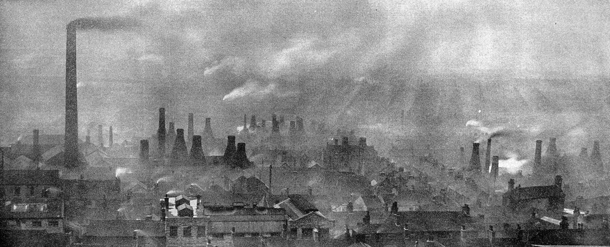
factory buildings, circa 1930. Welcome Foundation.
or tap on it. To return to this page, use your back button.
The need of a designer for the newly acquired china works arose because Carlton Ware's resident designer, Enoch Boulton, already had his capable hands full. He not only had to design new Best Ware patterns and Salad Ware shapes — not to mention other shapes — for the earthenwares made at Copeland Street, but also served as decorating manager, a role that included, among other duties, the complex task of settling the wages for the piece‑work carried out by his many decorators.
Miss Elmer carried out her china‑design work at the Copeland Street
Carlton Works as it was considered to be a more suitable place for her to be, though from time to time
she visited the nearby Vine Street china works. During the brief three years or so of china tea and coffee
ware production, the young designer produced hundreds of Carlton China patterns — so many that Enoch Boulton
would tell her to slow down. Inevitably, she came to know 'Enie' well. "We got on like a house
on fire," she remarked.
Two years later, when Boulton left for Fielding's, Cuthbert asked Violet whether she felt able to design
for Carlton Ware. "Oh yes," she declared with great confidence though she was frank about her inability
to settle piece-work rates with the decorators. To address this, a Mr.
E. S. Nixon was brought in from Vine Street to undertake
the task.
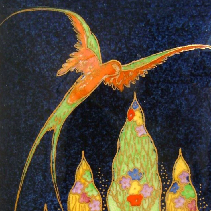
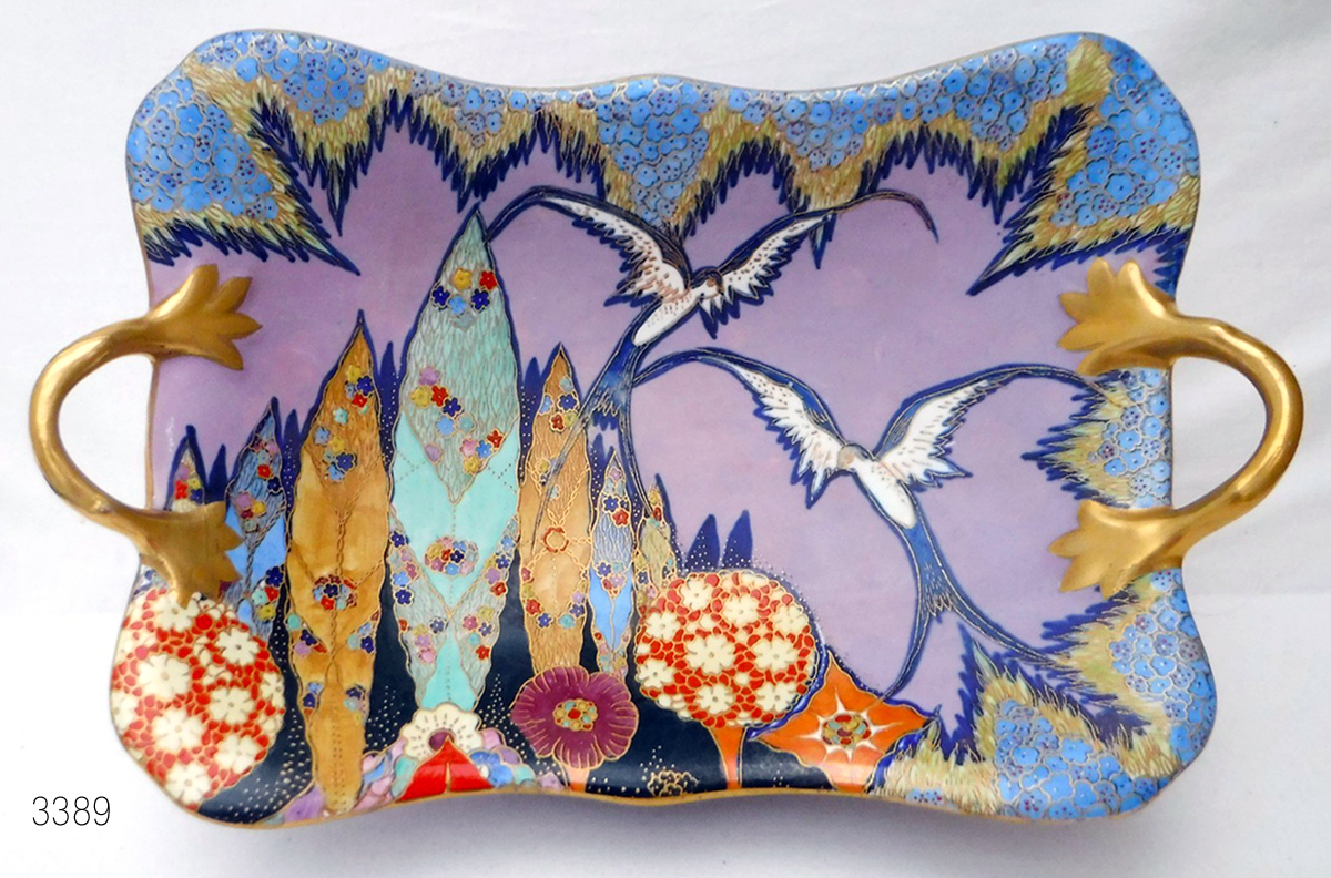
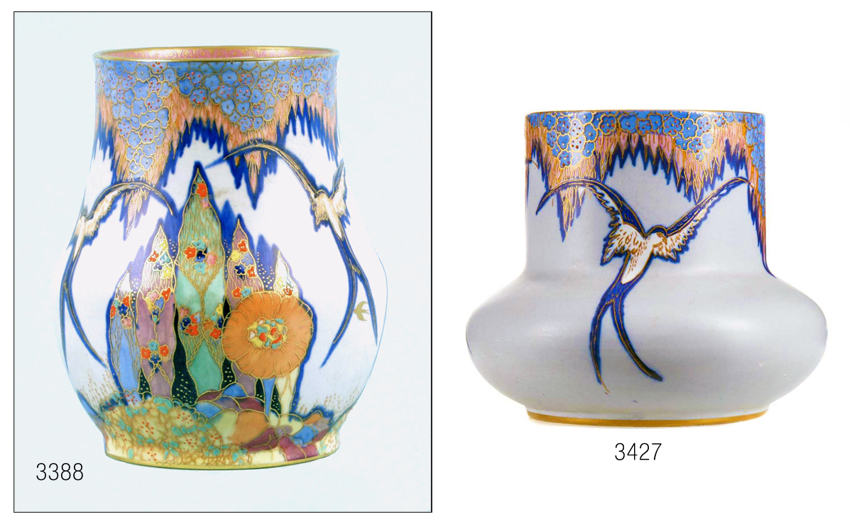
Miss Elmer told us that one of her first patterns for Carlton Ware's Best Ware was Fantasia so named by collectors in the 1980s after a similar, but later, pattern that Enoch Boulton designed for Crown Devon around 1933/4 — evidence to follow. Miss Elmer's first variant was allocated the pattern number 3388 and introduced in 1930; it has a matt GREY ground and is shown on the globular vase below.
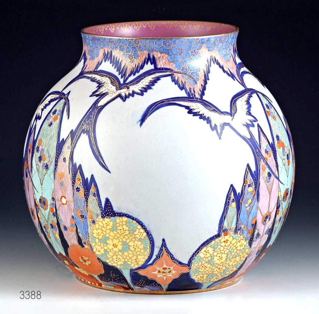
raised enamels; canopy pale blue & orange; reprinted and finished in gold.
To return to this page, use your back button.
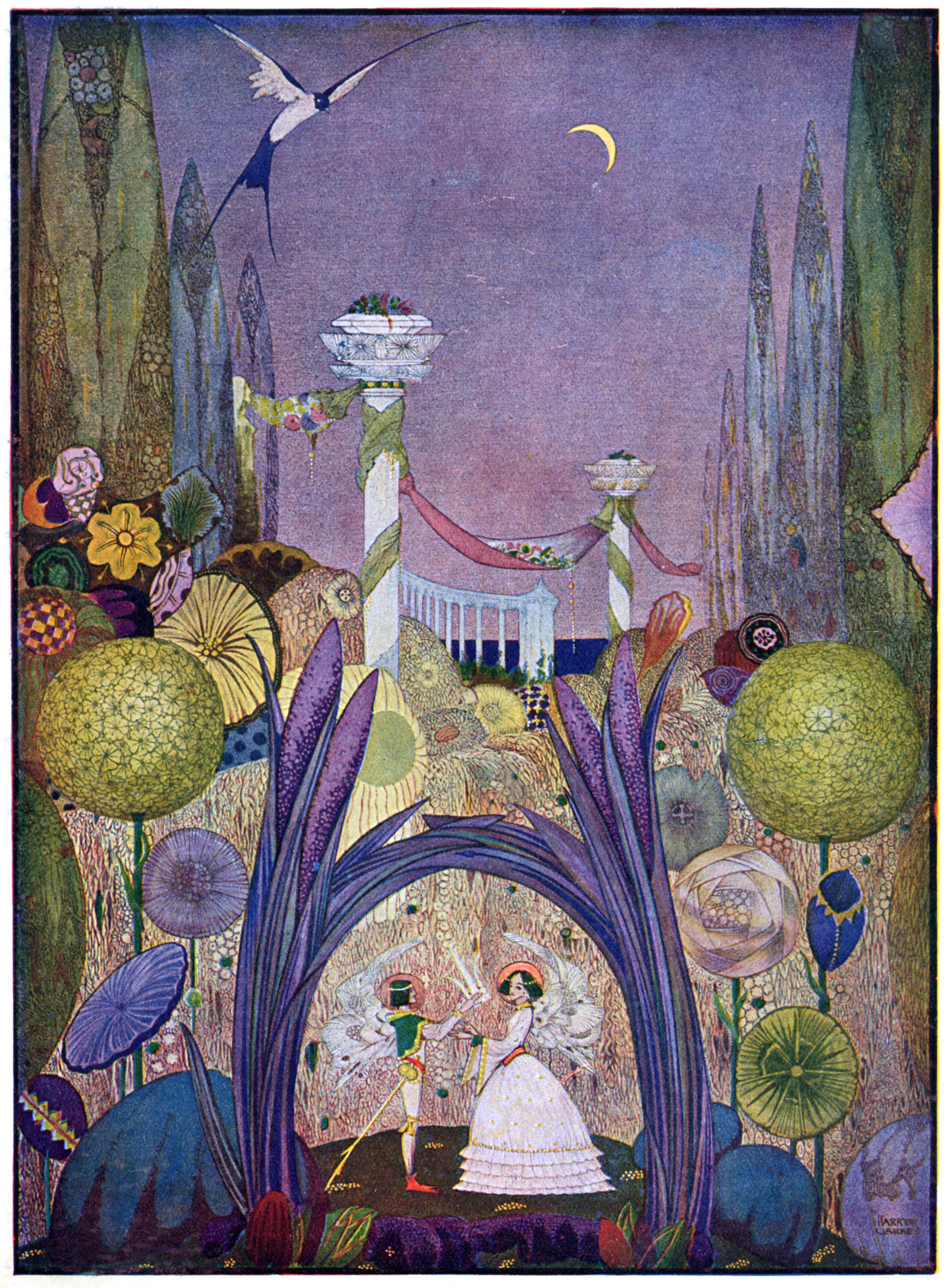
Clearly, the pattern is an adaptation of elements from an illustration by Harry Clarke in the 1916 George Harrap edition of Andersen’s Fairy Tales shown below. Clarke’s cigar‑like tall trees, lollipop trees, and bird are all echoed in the pattern, though Miss Elmer elaborates on each to suit the raised enamelling and gold printing for which Carlton Ware was known — and in which it excelled.
To return to this page, use your back button.
Just as I have suggested that Cuthbert Wiltshaw may have shown Enoch
Boulton some of Kay Nielsen’s illustrations for inspiration, it is equally possible that he did the
same with Miss Elmer and Clarke’s work. By this time Cuthbert had four young daughters, for whom children’s
fairy‑story books would almost certainly have been bought. Or perhaps Miss Elmer herself still had the
same edition of
Andersen's Fairy Tales
from her not‑too‑distant childhood.
Perhaps the then twenty‑three‑year‑old designer was drawn to the palette of colours in Clarke’s illustration,
as suggested by the second variant, 3389, which uses a striking matt
MAUVE
ground
— the same colour as the
illustrator’s sky — and as employed on the
FOOTED FRUIT
shown below.
underglaze printed & painted; raised enamels; canopy pale blue & green;
reprinted and finished in gold.
To return to this page, use your back button.
Even early on, Miss Elmer applies her 'signature' shadows to give depth to her work, as she did in many of her Best Ware designs — though on some variants of Fantasia that use them, the shadows are applied more discreetly.
Other Variants
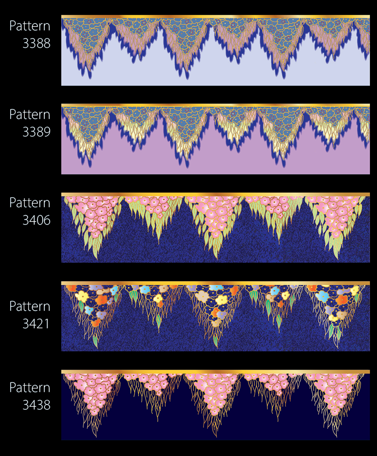
In total, eleven variants were recorded in Carlton Ware's pattern records.
The next in the sequence, 3406, employed a
POWDER BLUE
ground as shown below. Pattern number 3406A was identical excepting for a "
BRIGHT BLACK
" ground, bright presumably meaning shiny.
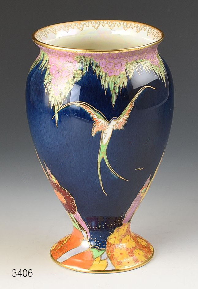
canopy lilac & green; raised enamels; reprinted and finished in gold.
Image courtesy of Andrew Muir.
To return to this page, use your back button.
Dorothy Faulkner, the 'Missus' in charge of the paintresses,
explained how patterns were produced. For posterity, I outline below the procedure for patterns
that were underglaze painted, a more elaborate process than those that were more simply
printed and painted on-glaze.
When ware has had its first firing, it comes off the ‘biscuit oven’ white and solidified from its ‘green’,
leathery-like state after being cast or turned on a wheel or lathe. The pattern is then printed ‘on biscuit’
in a pale grey — called smoke — and its entirety is masked by being painted over with quickly drying liquid clay.
An oil-based ground colour is then sprayed on to the ware using an aerograph.
The clay mask is then washed off with water, leaving the area occupied by the pattern print white and the
oil-based ground colour intact. The whole is then left to dry, or ‘harden on’, in a warm place,
ready for the pattern to be underglaze painted. After the underglaze painting, and once this too
is hardened on, the ware is dipped into glaze and fired in the oven once more.
It is then ready for gold printing,
raised enamels, and on-glaze lustres, if specified, before its final firing. The process is somewhat involved and
therefore costly, but the results are stunning.
Solid Grounds
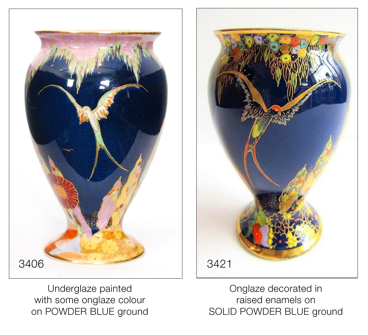
Another pattern, number 3421, also uses the same POWDER BLUE ground as on the vase above, but this time it is SOLID POWDER BLUE. Solid means that the ground colour is applied to the whole of the shape. The pattern is subsequently printed in gold directly on top of the glazed solid ground and raised enamelled — masking of the print area is not required. The raised enamels are significantly opaque and thickly applied so as to obscure the dark ground, giving a jewel-like appearance. On Fantasia 3421, parts of the pattern — in this case the bird’s wings — are hand-painted in gold, as are some elements of the trees. I show a comparison of the underglaze-painted 3406 and the SOLID POWDER BLUE version 3421 below.
To return to this page, use your back button.
Two variants omitted the trees, presumably for use on items where there was limited space, and perhaps to offer retailers and their customers a lower price since there was less decoration. Pattern number 3427, shown on the squat vase below, was the same as 3388, shown alongside, but without the trees. The other was 3428, which was the same as 3389, with its matt MAUVE ground, again barring the trees.
To return to this page, use your back button.
One variant, pattern number 3442, has a stippled ORANGE LUSTRE ground over a MATT glaze. Pattern 3740 has a DARK MATT BLUE ground, reserved for a lamp-base decoration. Finally, 3797 employs a SOLID RUBY ground. This last variant must have been offered three or four years after the pattern was first introduced in 1930, testimony to its popularity and of the RUBY ground.
I do not have examples of these last three variants to show, but if you have one, I can easily insert an image of it here. You can contact me through our sister Carlton Ware World on Facebook group.
Nomenclature
In the 1980s, Miss Elmer's Fantasia was so named by collectors after a similar pattern that Boulton designed for Crown Devon after his departure from the Carlton Works in 1930. Crown Devon's name for it was FANTAZIA, note the Z. The use of a similar name to that used by Crown Devon suggests that Fielding's produced the pattern first. But no.
Rationale
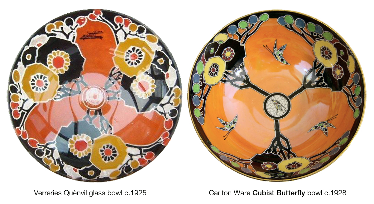
One of his Boulton's first patterns for his new employer, was a reworking of his Cubist Butterfly pattern for Carlton Ware, as demonstrated below. Click or tap on the comparison to enlarge.
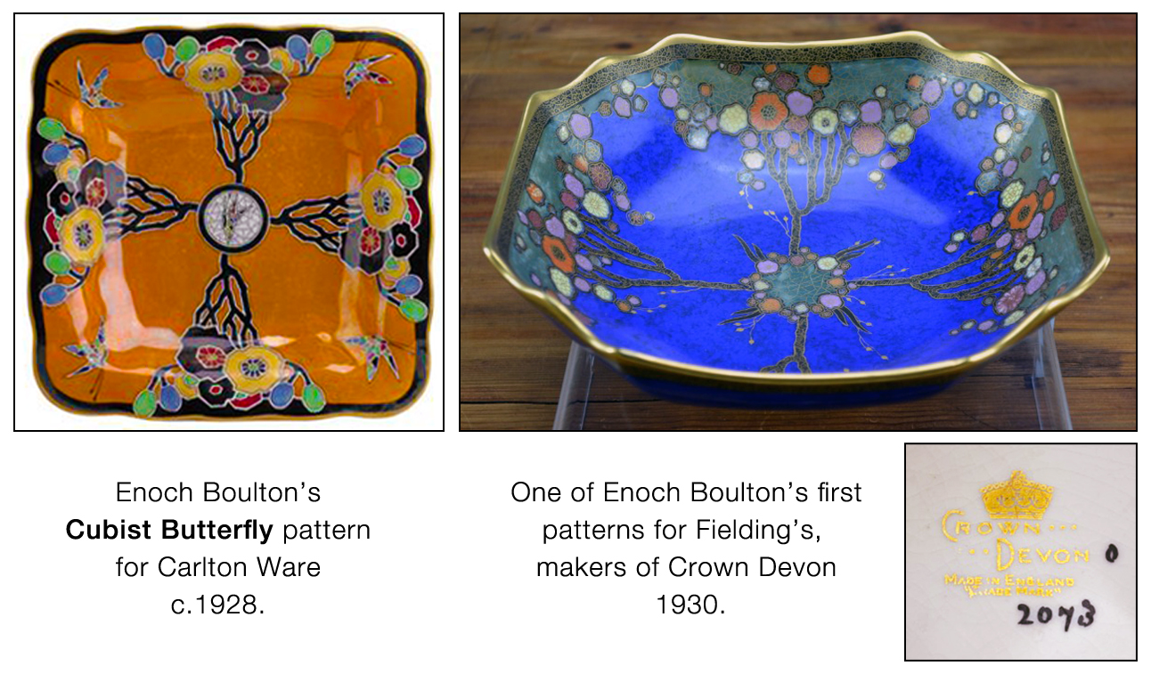
gold printed version from 1930. After an enamelled glass design by Henri Quènvil.
To return to this page, use your back button.
Cubist Butterfly
was largely adapted from a French
enamelled-glass design by Henri Quènvil,
probably at Cuthbert Wiltshaw's instruction after one of his visits to Paris. The Crown Devon version was allocated the pattern number
2073.
The first of Boulton's Crown Devon
FANTAZIA
patterns was given the pattern number
2444,
almost four hundred patterns later. Even allowing for a generous estimate of around one hundred new patterns, including variants,
being introduced each year, this places Fieldings
FANTAZIA
as having been introduced in 1933/4,
three or four years after Miss Elmer's
Fantasia pattern.
Borders
Violet Elmer takes borders to another level; her first for a Best Ware pattern on the Pottery's earthenwares was devised for Fantasia. Barb has redrawn it for us below. If you click or tap on it, you can view most of its striking colour variations.
 © Barbara Anne Lee 2026
Presumably, the newly appointed young designer adopted the house style
in use at the time, since the border has similarities to the canopy of the tree in her predecessor's
TREE & SWALLOW
pattern and to the related canopy in his
FOREST TREE
pattern, both introduced
in 1929, the year before Miss Elmer took over Best Ware
design from Boulton in early 1930. Examples are shown below. Click on the image
to see the canopies more clearly and to compare them with the border that Barb has drawn.

FOREST TREE patterns from 1929.
Fantasia Border, click or tap on the image. To return to this page, use your back button.
Several of Miss Elmer's china patterns feature trees with pendulous canopies, well suited to edges of teacups and plates. Below are two examples from 1929.
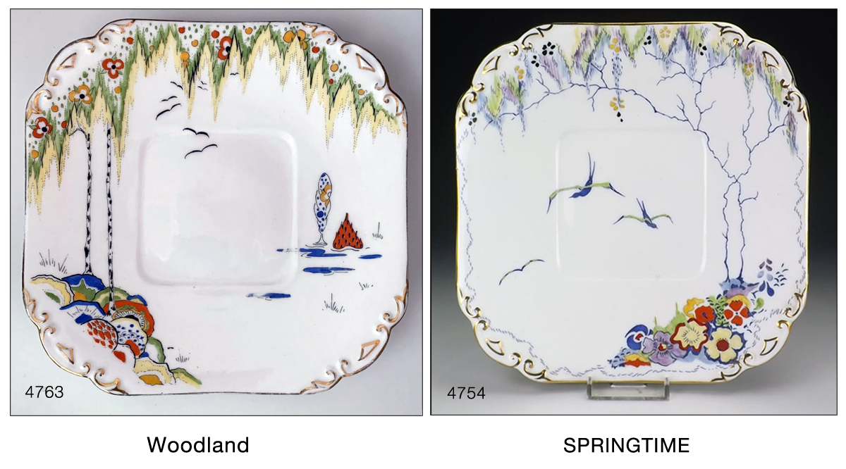
To return to this page, use your back button.
Perhaps Violet was more influenced by the weeping willow trees along the river in Oxford, her home town; she spoke fondly of boating on the Cherwell in the 1920s, that quintessentially Oxford pastime, and the leaves in her Fantasia Border are certainly willow-like.
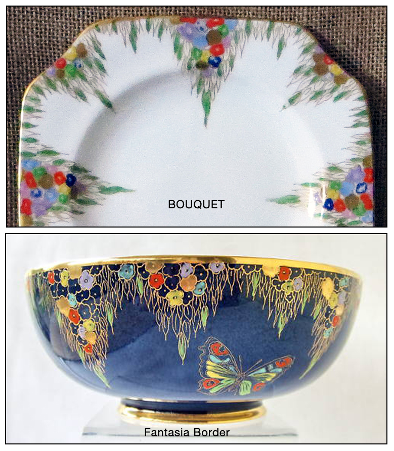
BOUQUET, another
of Miss Elmer's china patterns, also from 1929 — a border pattern — features canopy-like pendulous
leaves very similar to the border on
Fantasia,
though not as wide or deep. An example is shown on the right. I suggest that the
BOUQUET
china pattern was redrawn, enlarged, and widened for use as a border on
the earthenware pattern.
Click or tap on the 'trio' to see a comparison.
Origins - Boulton, Elmer or Zeitgeist?
Boulton's so-called Fairy Castle pattern for Fielding's, also introduced around 1934, uses a border strikingly similar to part of Miss Elmer's Carlton China Woodland pattern of 1929. A comparison is shown below. Click or tap on the image to enlarge it and see more detail.
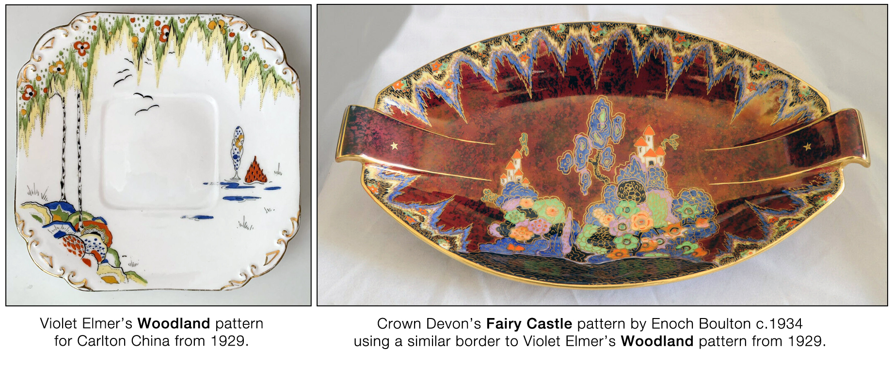
To return to this page, use your back button.
Perhaps Enoch was influenced by Violet's work and not the other way round — or perhaps both were simply responding to the same zeitgeist.
Date of Introduction & Availability
Fantasia, was introduced in 1930, although its final variant, 3797, did not appear until some four years later. As a popular pattern, it may well have remained available until the outbreak of the Second World War in 1939, or even until 1942, when war time restrictions curtailed all but the plain.
© Harvey Pettit 2026
V1 April 2026.
If new or more information comes to light, I will update this page.
The next article in this series
is about
BIRDS ON BOUGH.